The Unexpected Reason Pharmacies Are Always In The Back Of A Store
Along with grocery shopping, post office drop-offs, and a run through the car wash, a pharmacy visit is a routine errand for many Americans. According to the U.S. Centers for Disease Control and Prevention (CDC), from 2015 to 2018, nearly 49% of people across the country were reported to have used one or more prescription medications within the last 30 days. More recent data reveals that in 2021, approximately 6.47 billion prescriptions were administered in the U.S. (via Statista).
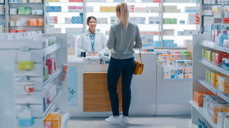
Unless you're hitting the pharmacy drive-thru window, you'll have to park and make your way to the back of the store to pick up your prescriptions. With so many people in need of their medications, trekking through the whole store certainly feels like an extra step. Is there any real rhyme or reason for a drugstore to be designed in such a way? As it turns out, there is some logic behind it, as doing so may increase the odds of additional consumer purchases. According to pharmacy shelving experts Shelving Design Systems, situating the pharmacy at the front of the store means that customers won't get a full view of what else the store has to offer. In other words, they're less likely to cross paths with the hair care aisle and suddenly remember they're low on conditioner.
Pharmacy features that may increase customer purchases
In addition to placing the pharmacy towards the back of the store, drugstores may also cater to customers' natural shopping behaviors. Shelving Design Systems reports that shoppers tend to look left when first entering a store and then proceed to the right. By designing the layout of a drugstore in such a way that leads customers to the right and progressively back towards the pharmacy, this further boosts the chances that a customer may pick up a little something extra.
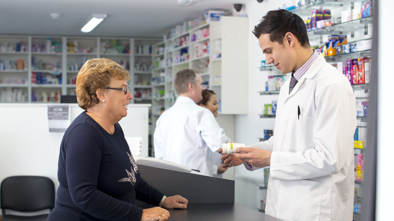
The design features of the pharmacy itself can also support additional customer purchases. A more spacious checkout counter, for instance, leaves room for more items. On the other hand, a small counter leaves minimal space for anything beyond one's prescriptions. Another common pharmacy feature is a sitting area for patients who may be waiting on refills or a vaccination appointment. Facing these chairs towards commonly-purchased items such as over-the-counter (OTC) pain-relief medications, lip balm, or cough drops increases the likelihood that a customer may buy an additional item once they check out.
Placing pharmacies towards the back of a store may offer patients more privacy
Keeping pharmacies tucked away in the back of a store may help boost sales, but that might not be the only reason why drugstores are laid out this way. Researchers from a 2016 study published in Health Expectations conducted interviews with 25 pharmacists and over 50 pharmacy customers in Australia during the summer of 2013. They asked participants about how pharmacy practices and design layouts either enhanced or diminished feelings of privacy.
Some privacy concerns brought up by participants included pharmacists calling out the name of a customer's medicine, conversations being overheard at the counter, or visibility of products at the checkout counter by nearby customers. With so many people coming and going at the front of a store, this increased foot traffic may heighten privacy concerns amongst pharmacy customers. Placing the pharmacy at the back of the store, however, may make customers feel more at ease.
When asked about pharmacy quiet areas, semi-private areas, or private consultation rooms, many participants and pharmacists were in support of more private consultation spaces. However, issues of available floor space and pharmacist workflow disruption were also noted. Overall, the researchers highlighted the importance of optimizing pharmacy layouts to cater to patient privacy needs.


